The Making of… Fate Actually – Part 2
With part 1 covering the pre-production side of this fan book, part 2 focus on how the artwork is created and the thought process behind the book layout.
Thumbnails Galore
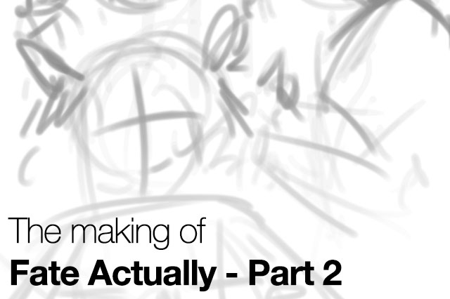
The thumbnail process is something that any artist worth their value should practice. I use it as a way to arrange elements and also identifying poses without spending too long like regular sketches.
Majority of my artworks is done 100% digitally. I rarely sketch with traditional medium and prefer to jump into Paint Tool SAI or Photoshop to do my thumbnails.
The following four pictures shows the thumbnail and the final lineart:
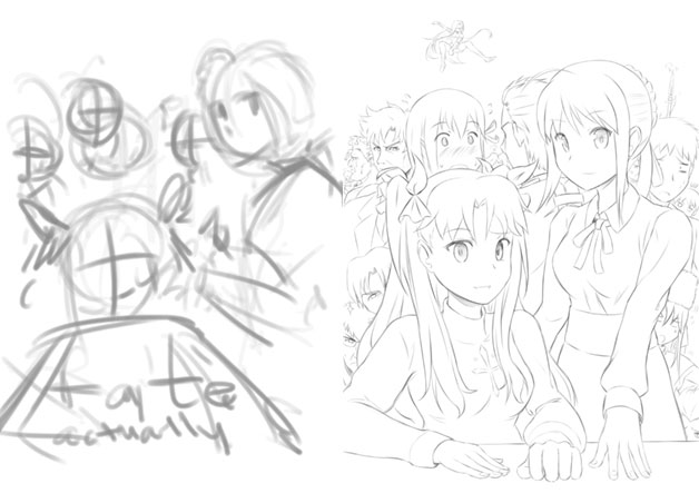
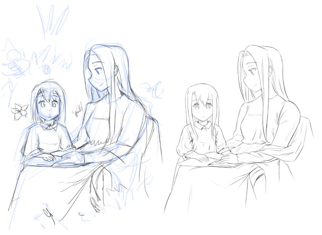
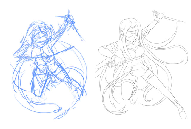
^Guess the sketchy thumbnails can be hard to understand for others.
For me, the lineart process can be the most time consuming part compared to the colouring process. Still it depends on the subject matter and if there is a very detailed background, the colouring process will be the longest part instead.
Gotta Go Fast
Due to my work habit, I rarely record video as I switch between applications frequently. As a bonus and promotional material for this fan book, I recorded two timelapse videos of my drawing process.
Both videos are sped up around 20 times faster than real time.
Arranging the book layout in InDesign
I admit I’m still a complete beginner in the world of DTP (desktop publishing). It is one of those easy to learn, hard to master skills as designing something in the digital environment does not necessarily translate accurately in the real world of printing.

^The UI for Adobe InDesign CS6. Well one can arrange such layout in Photoshop but it is better to do it in the right application.
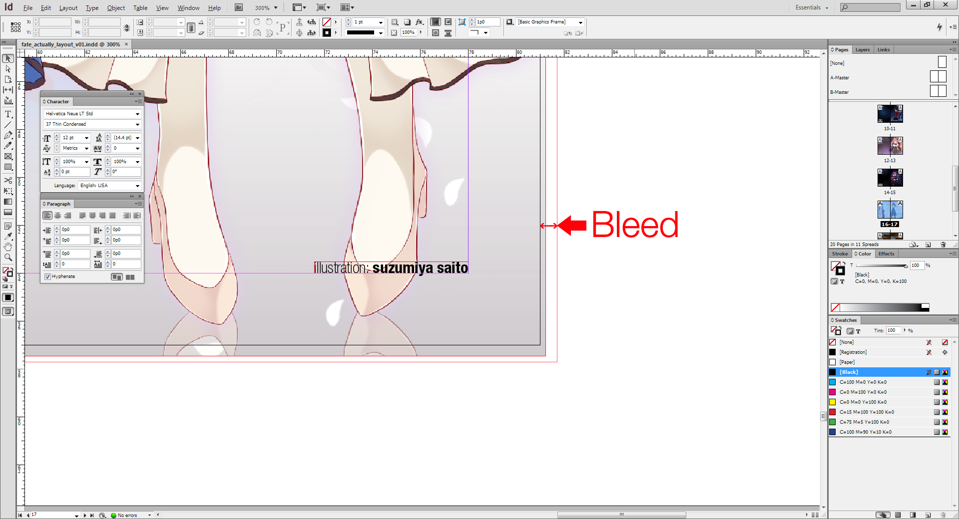
^Any DTP artist will need to ensure that there is bleed or risk having white line as the printer cut your printed pieces.

^Arranging text layout is really intuitive in InDesign.
I went with a full colour background as I find it a waste to leave big white space when you already paid for it. Also this is my first attempt to print white text on a dark background which can be an issue for some printers.
It is best if you have access to printers who will advise you in the pre-printing stage to avoid potential problem that will ruin your final printed products. Preferably honest printers are hard to find around Malaysia since majority of the printers that I went are interested with your money only.
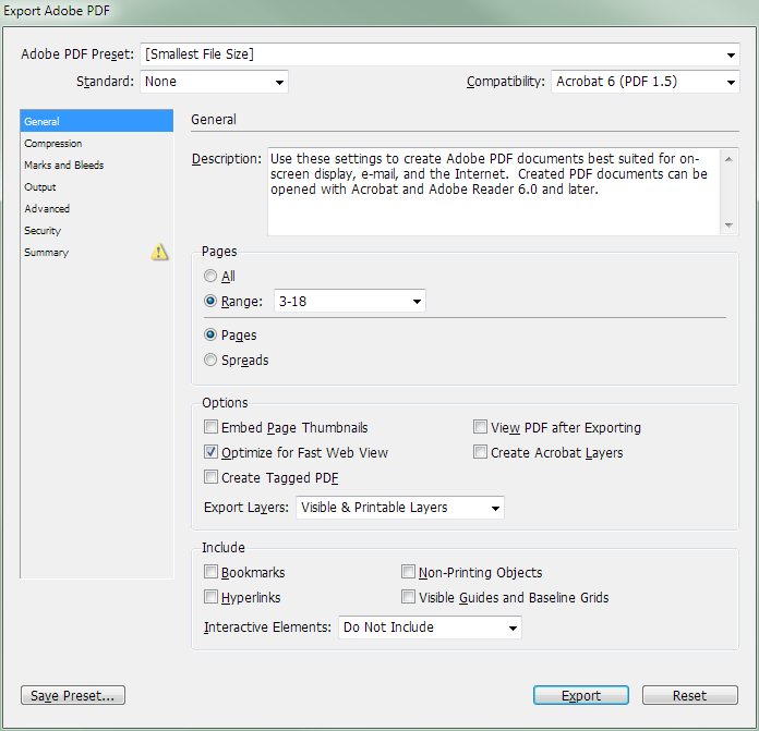
^ Once I’m satisfied with the layout, it’s time to export it as PDF for the printers.
Overall InDesign is something that I self taught through books and online tutorials. While my skills for it is nothing to shout about, I find it interesting to see it everything piece together with InDesign.
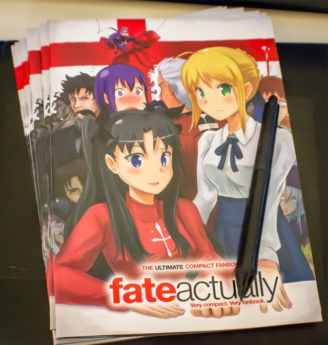
^ The final product with the Wacom Intuos4 stylus as scale reference.
The end is the beginning is the end
So that concludes part 2 of this making of. There is more stuff that I haven’t reveal in this making of but in the end, that is like giving out everything from the book.
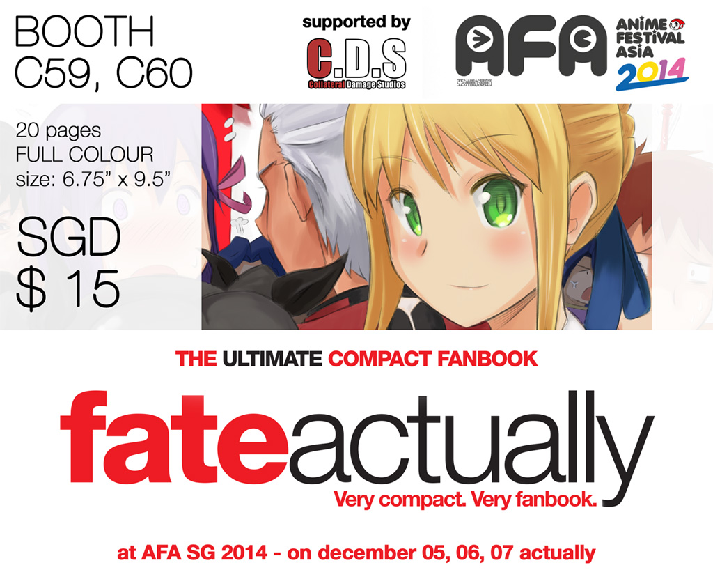
Thanks for reading and remember Fate Actually will be on sale at SGD $15 at AFA Singapore 2014! Come visit me at booth C59 and C60 which happened to be Collateral Damage Studios booth. Huge thanks to KC for the help in securing a booth for me and my partner in crime for the event!

